
Can You Handle it Tours
Brand Designer & Graphic Designer
Freelance Client
November 2021 - Current
Company Overview
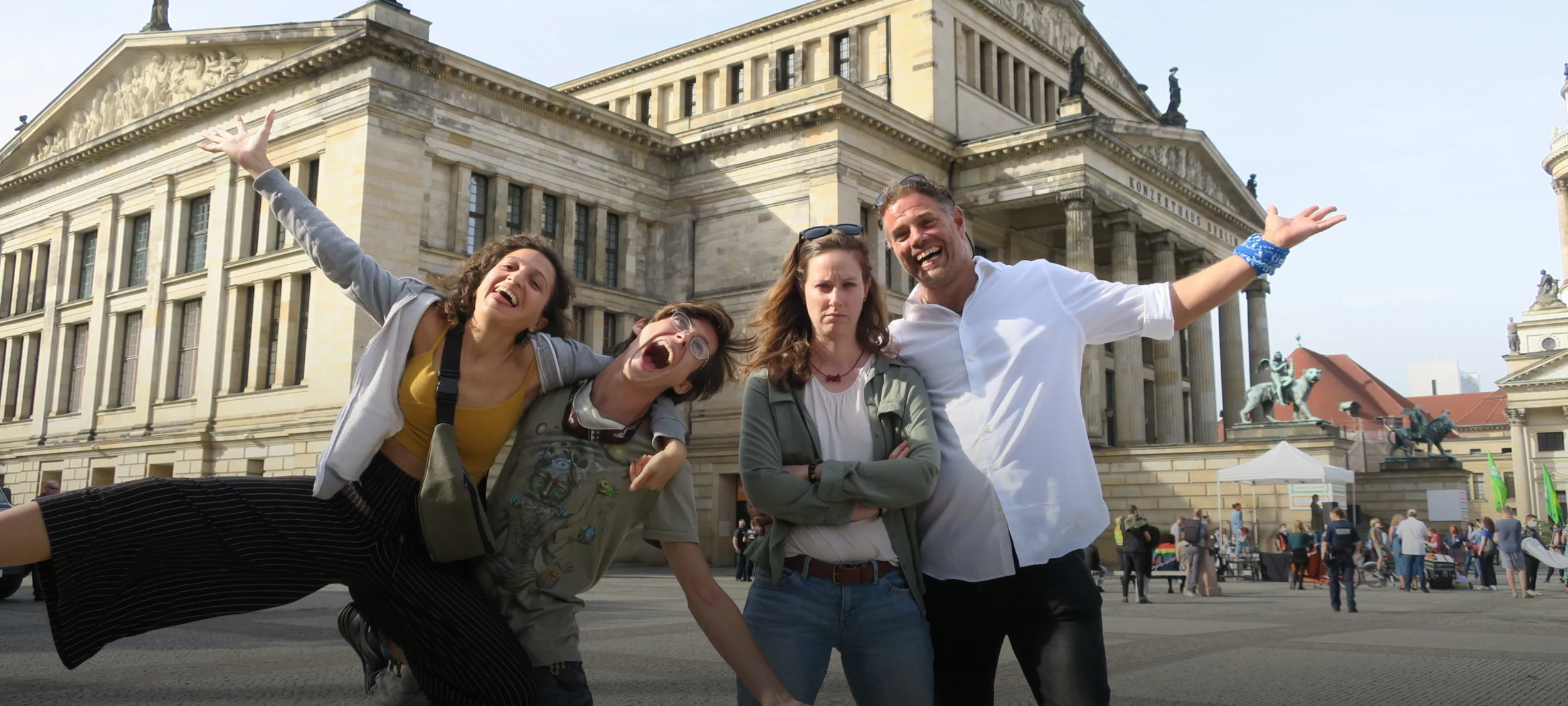
A dynamic and unconventional walking tour provider known for its energetic, performance-style tours infused with humor, insider anecdotes, and playful irreverence. The company offers both free and paid tours across major European cities including Berlin, Amsterdam, Cologne, Stuttgart, Brussels, Paris, and Nottingham Can You Handle It?
Key Deliverables
Complete overhaul of brand identity, and personality (logo, colors, typography, voice
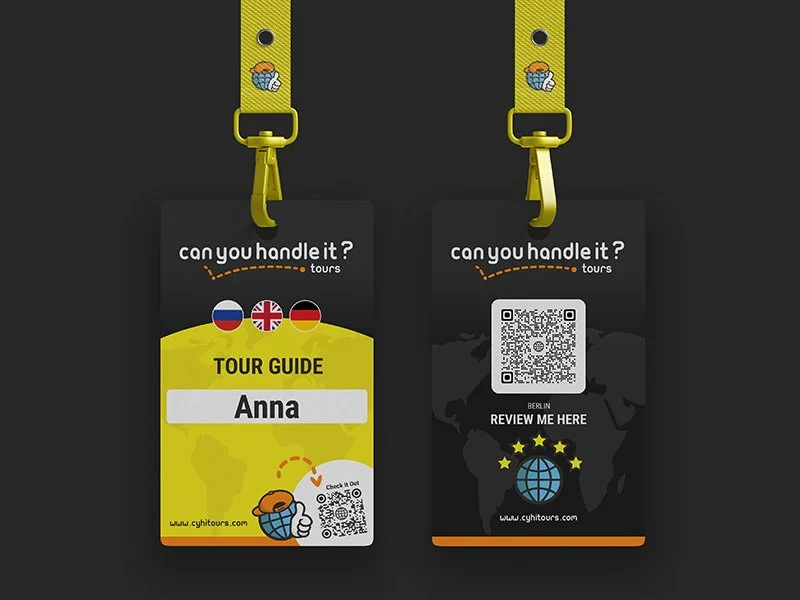
Creation, coordination, and upkeep of print and digital marketing assets
Ensure brand cohesiveness during country expansions
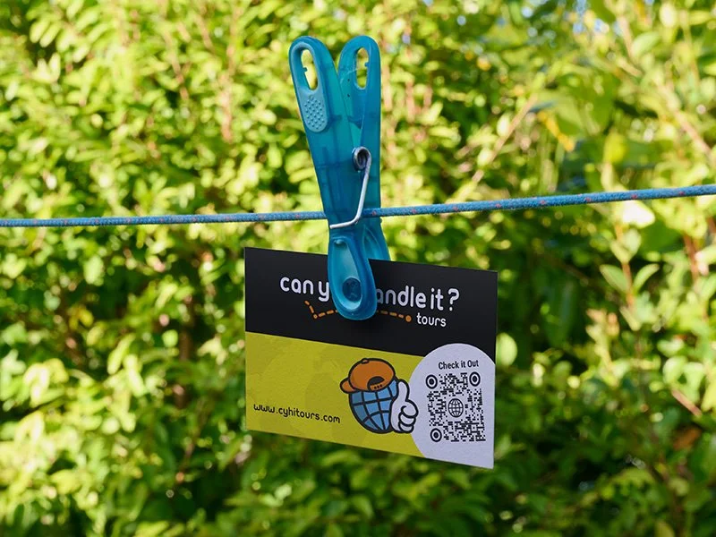
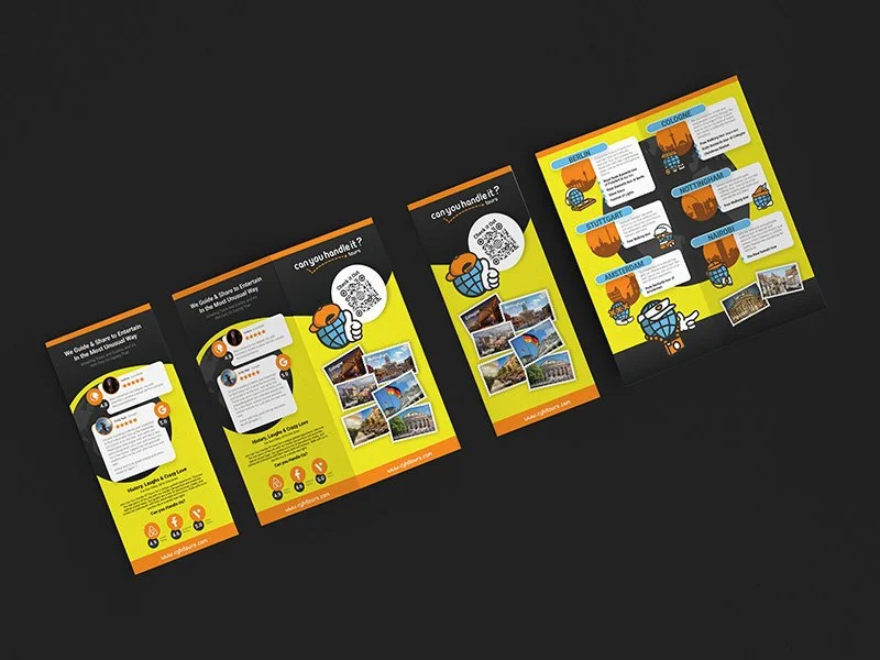
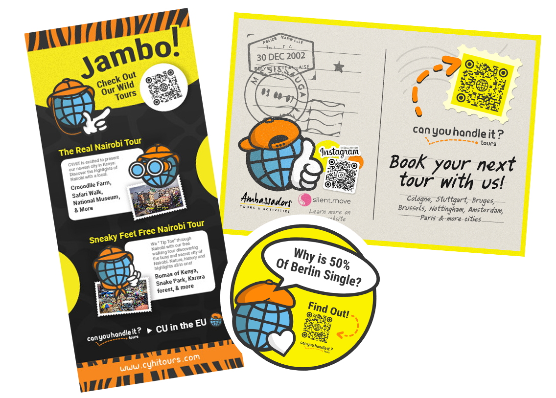
print and Guerrilla style campaigns
Impactful print campaigns such as flyers, posters, brochures, banners, and magazine ads that are visually striking and optimized for high-quality printing. Alongside traditional print, I also create guerrilla-style marketing material that use unconventional, creative, and attention-grabbing ideas to surprise and engage audiences in strategic and unique ways.
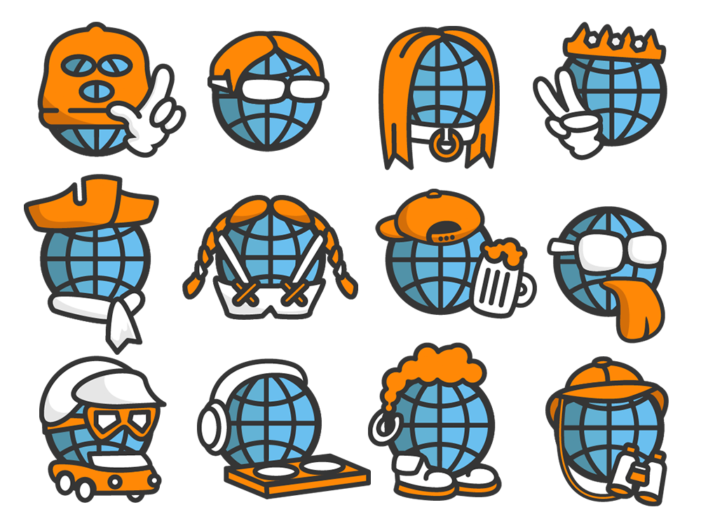
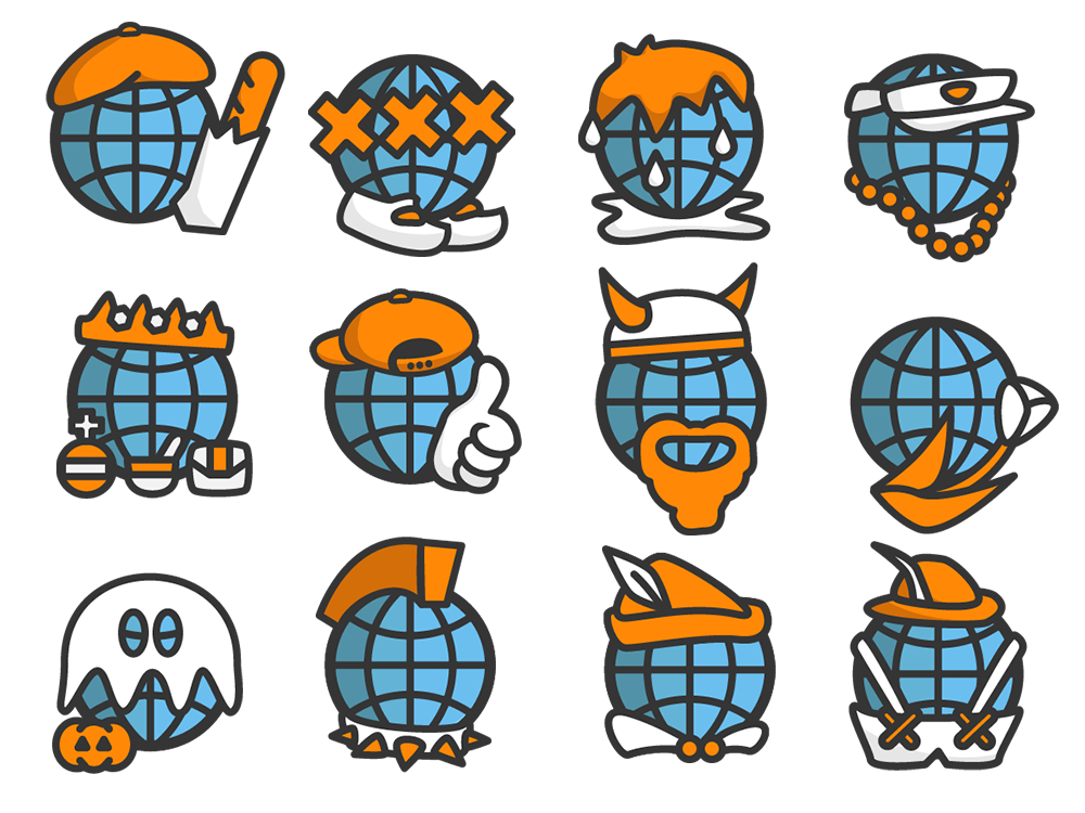
Kai Guy
Guy, inspired by our founder Kai Angelet, is the face of our company and your trusty travel companion. Having explored every city and seen countless sights, he shares fascinating facts, cracks jokes, and brings a sense of fun to every journey. Always sporting local gear, Guy makes learning engaging and inspiring, guiding you through new experiences while keeping each adventure lively and memorable.

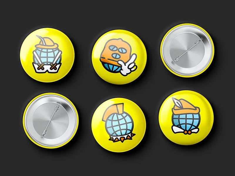
Logo
As a touring agency, we are always on the move, guiding curious travelers from one landmark to the next. The dotted line in our logo represents the journey—an ever-flowing path of discovery that connects major cities across the globe. Each stop along the way brings new knowledge, new laughter, and new memories, reflecting our belief that the hunger for exploration and learning is never truly satisfied.
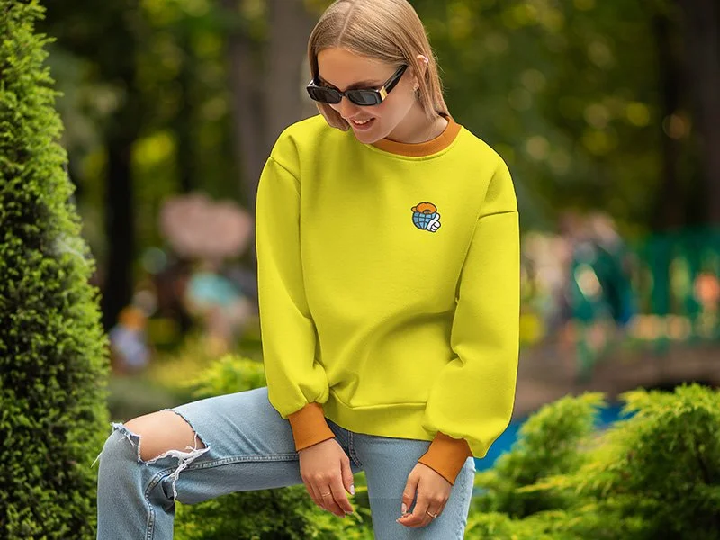
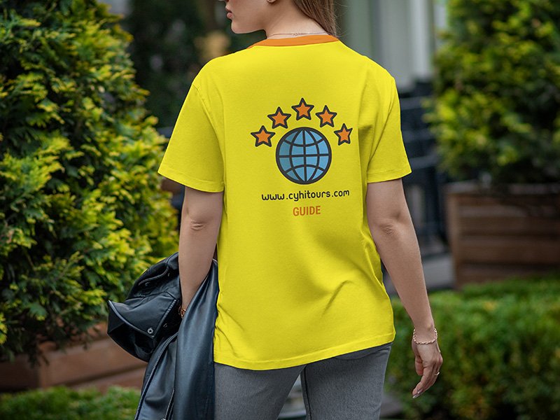
Colors
Our brand colors are bright, vibrant, and youthful, reflecting the energy of our tours. The vivid yellow captures the lively spirit of our guides and the exciting way they share information. The cool, balanced blue, used predominantly for Guy’s face, conveys a friendly, approachable, and inviting tone. Meanwhile, the warm orange serves as a highlight, emphasizing the unique and memorable characteristics of each city we explore. Together, these colors create a dynamic and engaging palette that brings our brand and adventures to life.